The Avant-Garde Influence in Posters

Throughout the course of art history, creative movements have helped define their respective eras while positing new possibilities for the next generation. This perpetual feedback loop has generated notable shifts in imagery, typography, and composition—many of which were completely radical when they first emerged. The history of poster design follows this ebb and flow of creative experimentation, from Germany’s Sachplakat style to Italy’s Futurism and the Soviets’ Constructivism. Here, we take a closer look at the influence of the Avant Garde on posterists.
The following posters are part of our 83rd Rare Posters Auction.
")
By Lucian Bernhard (1883-1972)
37 x 26 3/8 in./94 x 67 cm
Est: $4,000-$5,000
37 x 26 3/8 in./94 x 67 cm
Est: $4,000-$5,000
During the 1910s and ’20s, Bernhard executed at least a dozen designs for Manoli, a Berlin-based cigarette factory founded in 1894 by Jakob Mandelbaum. This one is a quintessential example of Bernhard’s characteristic Sachplakat aesthetic, in which the image is diluted down to its most vital essences: the brand name and the product sit against a deep black background. But rather than coming off as stark, the image is coyly enticing: a chic flip-top deck presents its pleasures while a single cigarette teeters off the edge, beckoning the nicotine lover to indulge.

By Filippo Tommaso Marinetti (1876-1944)
Each: 12 1/4 x 15 3/8 in./31 x 39 cm
Est: $2,500-$3,000
Each: 12 1/4 x 15 3/8 in./31 x 39 cm
Est: $2,500-$3,000
Filippo Marinetti was an Italian ideologue, poet, editor, and founder of the Futurist movement of the early twentieth century. Marinetti, most noted for his authorship of the “Futurist Manifesto”—first published in the Paris newspaper Le Figaro—also published this important Futurist touchstone, “Les Mots en Liberté Futuristes.” The plates were inserted and folded several times in order to make them fit into the small book, and the images display the typographic method fervently espoused by that particular movement. “The postwar years gave new impetus to the spread of modernist aesthetics to the more popular artistic mediums… Marinetti sought to give visual expression to the anarchic energy of war, the big city, and the rioting crowd… Setting out to destroy all literary and typographic rules, Marinetti called for the abolition of punctuation, the adverb, and the adjective to break down completely the traditional continuity and order of writing. The Futurists also had a particular interest in the medium of print, not just as a vehicle for their poetry but for the purpose of proselytizing their ideas on subjects touching all aspects of life—from sculpture to lust. Although they produced almost no typographically advanced posters, the revolution the Futurists initiated in typography proved fundamental. Through their influence on Dada and the Russian avant-garde they contributed to the development of the new typography in the 1920s” (Modern Poster, p. 20-21). This lot includes four proofs for two plates of the book. (4)

By Jozef Peeters (1895-1960)
Each: 8 7/8 x 12 in./22.6 x 30.5 cm
Est: $2,000-$2,500
Each: 8 7/8 x 12 in./22.6 x 30.5 cm
Est: $2,000-$2,500
Jozef Peeters is considered to be one of the first Belgian abstract painters. A member of the Futurist movement, Peeters was engaged in symbolism, theosophy, Constructivism, and typographic experimentation. In 1918, he helped found the Kring Moderne Kunst (Modern Art Circle) in Antwerp; in 1921, he organized the First Congress for Modern Art; and in 1922, he became the editor of the literary magazine Het Overzicht. Here, Peeters presents his Avant Garde conceptions in two linocut prints which were preliminary designs for the announcement of “Moderne Dichten” (Modern Poems), recited by Germaine Michielsen at Beethoven Hall on February 25, 1921. The letters have been reduced to elemental shapes, forming an abstract composition that overpowers the need for legibility: the design, instead, is what captures our attention. Another version of this design appears in Merrill Berman’s collection, and he wrote, “If Antwerp’s artistic accomplishments of the early 1920s have attracted less attention than the subsequent achievements of Belgian Surrealist painters such as Paul Delvaux and René Magritte… this may in part reflect the complexities of Belgian history. Many of the figures featured here promoted Flemish language and culture, but when nationalism became a polarizing force in the late 1920s, only some found common cause with Germany and followed the trajectory toward collaboration.” Of these two prints, one is on gold leaf stock and one is black and white; on verso, both are stamped “luxe-uitgave,” or “luxury edition.” (2)

By Theo Van Doesburg (Christian Kuepper, 1883-1931) & Kurt Schwitters (1887-1948)
11 3/4 x 11 3/4 in./30 x 30 cm
Est: $6,000-$8,000
11 3/4 x 11 3/4 in./30 x 30 cm
Est: $6,000-$8,000
Kurt Schwitters and Theo van Doesburg “embarked on a tour of Holland to introduce Dada to the local artists and the public through lectures and performances. Van Doesburg’s pamphlet ‘Wat is Dada?’ was for sale at the close of each stop. The poster for the Small Dada Evening includes the event program, which lists ragtime music by the composer Erik Satie, abstract poetry by Schwitters, and ‘Dadasofie’ by Doesburg. The poster is decorated with multi-lingual slogans including: ‘Dada est contre le futur, Dada est mort, Dada est idiot, vive Dada!’ (‘Dada is against the future, Dada is dead, Dada is idiotic, Long live Dada!’)” (MoMA exhibition wall plaque).

By Niklaus Stoecklin (1896-1982)
36 x 50 in./91.8 x 127 cm
Est: $1,700-$2,000
36 x 50 in./91.8 x 127 cm
Est: $1,700-$2,000
Stoecklin’s design for an automotive tire is a quintessential example of Neue Sachlichkeit, or New Objectivity. There is absolutely nothing extraneous, except for Stoecklin’s impressive photographic precision: each joint, angle, and texture of the tire is meticulously rendered with disciplined accuracy. After all, our attention should be focused on the engineering feat of J. Petitjean, and that is precisely what Stoecklin delivers.

By Pieter Adrianus Hendrik Hofman (1885-1965)
24 1/4 x 36 7/8 in./61.5 x 93.7 cm
Est: $1,200-$1,500
24 1/4 x 36 7/8 in./61.5 x 93.7 cm
Est: $1,200-$1,500
This stylized composition with a swift messenger carrying a staff uses plenty of angles to give a feeling of urgency and speed. In this poster for the Dutch Fair at Utrecht—as well as in Hofman’s other posters—typography plays a vital role. The poster was printed with several different texts and the space at bottom was used for each year’s particulars. Hofman was a painter of landscapes, seascapes, and portraits; he designed windows, murals, and book covers too.

By Gustav G. Klutsis (1895-1938)
28 7/8 x 41 1/4 in./73.3 x 104.7 cm
Est: $8,000-$10,000
28 7/8 x 41 1/4 in./73.3 x 104.7 cm
Est: $8,000-$10,000
“A Latvian subject of the Russian empire, Gustav Klutsis came to Russia proper during the 1917 Revolution as part of a volunteer machine-gunner unit that helped to topple the czar and safeguard the new Soviet leaders, including Vladimir Lenin. Klutsis had studied painting at home and continued in art schools during and after his military service, ending up at the radically progressive Higher State Artistic and Technical Workshops (VKhUTEMAS)—the cradle of Constructivism. By the early 1920s, Klutsis had worked his way through the rigorous exploration of elemental shapes and basic materials called for by that movement and began to put the Constructivist ethos of honesty and utility to use in agitational propaganda… Klutsis brought photomontage to its peak of expression in posters from 1930 and after that blended workers’ bodies (in some cases his own) and their machines with the heads of leaders of the Soviet state to forge a collective juggernaut for modernization. These posters, printed in the tens of thousands, helped transform the Soviet visual landscape in the early Stalinist era. Nevertheless, Klutsis was killed along with scores of other Latvians on Stalin’s orders during purges later in the decade” (Art Institute of Chicago). The text here reads, “With the efforts of millions of workers involved in the socialist competition, we will convert the five-year plan into a four-year plan.” Please note: all known copies are trimmed at the top and left edges. Rare!

By Vasilii Federovich Mironenko (1910-1964)
19 1/2 x 29 1/4 in./49.6 x 74.2 cm
Est: $2,000-$2,500
19 1/2 x 29 1/4 in./49.6 x 74.2 cm
Est: $2,000-$2,500
In a poster that hints at elements of Constructivism, the Ukrainian proletariat is reminded that it is their duty to avidly support the country’s increased aircraft production as it serves to strengthen their cause. The initials KIM in the upper left stand for “Kommunistichesky Internatsional Molodyozhi” or “Youth Communist International,” a parallel international youth organization affiliated with the Communist International in the early years of the Soviet Union.

By Umberto di Lazzaro (1898-1968)
24 1/4 x 39 3/8 in./61.6 x 100 cm
Est: $3,000-$4,000
24 1/4 x 39 3/8 in./61.6 x 100 cm
Est: $3,000-$4,000
One of the finest Italian aviation posters ever produced, this bold design cuts through Futurist color planes to express the pure mass and swift movement of Italian Airlines’ fleet. This is the English-language version of the image.

By Johannes Handschin (1899-1948)
35 5/8 x 50 1/2 in./90.5 x 128.4 cm
Est: $3,000-$4,000
35 5/8 x 50 1/2 in./90.5 x 128.4 cm
Est: $3,000-$4,000
Two architectural statements do all the talking in this design: an Art Deco spire with an increasingly warming glow and a Bauhaus-style structure beside it. This graphic tour de force advertises the Basel-based architect, A. Gasser. In addition to being able to create the perfect edifice to suit any client’s needs, he also served as a real estate agent with properties available for purchase or rental. Little is known about Handschin other than that he was a painter and graphic artist active in Basel. Rare!
")
By Tadanori Yokoo (1936- )
28 3/4 x 40 3/4 in./73 x 103.6 cm
Est: $12,000-$15,000
28 3/4 x 40 3/4 in./73 x 103.6 cm
Est: $12,000-$15,000
Kurt Schwitters and Theo van Doesburg “embarked on a tour of Holland to introduce Dada to the local artists and the public through lectures and performances. Van Doesburg’s pamphlet ‘Wat is Dada?’ was for sale at the close of each stop. The poster for the Small Dada Evening includes the event program, which lists ragtime music by the composer Erik Satie, abstract poetry by Schwitters, and ‘Dadasofie’ by Doesburg. The poster is decorated with multi-lingual slogans including: ‘Dada est contre le futur, Dada est mort, Dada est idiot, vive Dada!’ (‘Dada is against the future, Dada is dead, Dada is idiotic, Long live Dada!’)” (MoMA exhibition wall plaque).

By Alfonso Iannelli (1888-1965)
31 1/2 x 41 1/2 in./80 x 105.4 cm
Est: $2,000-$2,500
31 1/2 x 41 1/2 in./80 x 105.4 cm
Est: $2,000-$2,500
With obvious influences from the Secessionist movement, this silkscreen poster in metallic gold and rich red promotes a performance by the vaudevillian song-and-dance duo George A. Whiting and his eventual wife, Sadie Burt. It was originally done by Iannelli as a hand-painted sign outside the Orpheum theater in Chicago. In 1969, the Chicago School of Architecture Foundation obtained permission from the artist’s estate to reproduce six of his designs in editions of 1,000. This is from that run.

By Peter Max (1937- )
35 7/8 x 24 3/8 in./91 x 62 cm
Est: $2,000-$2,500
35 7/8 x 24 3/8 in./91 x 62 cm
Est: $2,000-$2,500
Psychedelia, peace and love, and the historic Apollo 11 moon landing: this design is a veritable time capsule of the energy and spirit of the late 1960s. Even before the moon landing, Max was interested in astronomy, which fed into his “Cosmic ’60s” period of trippy countercultural imagery. So he was a natural fit for this poster which commemorates the successful mission of the Apollo 11 team. Max later invited Buzz Aldrin to his studio, where they cemented a friendship over their shared interest of the cosmos. This poster is hand-signed by Max and Aldrin.

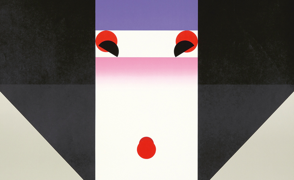
By Ikko Tanaka (1930-2002)
28 5/8 x 40 1/2 in./72.8 x 103 cm
Est: $1,000-$1,200
28 5/8 x 40 1/2 in./72.8 x 103 cm
Est: $1,000-$1,200
A geisha is brilliantly abstracted into geometric form: a specialty of Ikko Tanaka, who created a style of graphic design that fused modernist principles and aesthetics with the Japanese tradition. It’s probably Tanaka’s most representative work, among a portfolio that includes work for Mazda and Issey Miyake. It’s one of a series of twelve posters made by Japan’s leading graphic artists for the 1981 Asian Performing Arts Festival held at UCLA. Nihon Buyo refers to a Japanese performing art that includes elements of dance and pantomime.

By Keith Haring (1958-1990)
23 x 29 1/2 in./58.2 x 74.8 cm
Est: $1,200-$1,500
23 x 29 1/2 in./58.2 x 74.8 cm
Est: $1,200-$1,500
Keith Haring created an exciting, mazy motion to promote his own exhibition at FUN Gallery at 254 East 10th Street in the East Village in February, 1983. He personally financed the prints, and handed them out to fans who flocked the gallery. “FUN Gallery was a place where neighborhood kids, downtown artists, b-boys, rock, film, and rap stars mixed with museum directors art historians and uptown collectors at wild openings featuring artists like Futura, Fab 5 Freddy, Lee Quinones, Kenny Scharf, Keith Haring and Jean Michel Basquiat,” PAPER Magazine reminisced in 2012. Though the gallery only survived for four years, its heralding of boundary-busting experimentation helped pivot the art world as we know it.
PAI-LXXXIII: Rare Posters will be held March 14 at 11am EDT.
It’s better with a book.
Order the Rare Posters Auction catalogue now
for full details on all 500 lots